Case Study
Case Study: Bidwell Consulting, Commercial-Grade Selection at Residential Standards
Commercial surface specifications operate under different constraints than residential. The use intensity is higher, more foot traffic, more wear cycles, less owner attention to maintenance. The aesthetic standards remain residential-grade, clients walk through a commercial space and read it the same way they'd read a luxury home. The challenge is delivering both: surfaces that hold up to commercial use while reading premium-residential.
Bidwell Consulting's project was exactly this kind of specification, a professional-services environment that needed to read sophisticated to clients while handling the use realities of a working commercial space. This case study walks through how the specifications came together and what made the project work.
The Project Context
The starting point was a professional consulting office with significant client-facing space, reception, conference rooms, executive offices, common areas. The owner wanted the space to read as residential luxury rather than as standard commercial finish, while delivering the durability that 50+ daily client visits demand.
The specification challenge had several dimensions. The flooring would see meaningfully more traffic than residential equivalents, wet shoes in winter, dragged office furniture, occasional spilled coffee, daily cleaning crews. The countertops in conference rooms and break areas would absorb commercial use patterns. The walls would see incidental contact in ways residential walls don't. Standard residential specifications would wear through; standard commercial specifications would read institutional. The right specifications had to find the middle.
The Flooring Decision
Several material categories were on the table.
Hardwood, beautiful but vulnerable to commercial wear. Refinishing every 5-7 years in commercial settings is expensive and disruptive. Ruled out.
Premium luxury vinyl tile (LVT), durable, predictable, contemporary. The 22mil wear-layer Nove Reserve in the luxury vinyl flooring catalog was a strong candidate; commercial-graded LVT delivers 15-20 year service lives in commercial settings.
Premium porcelain tile, exceptional durability, contemporary read, high slip resistance available. The ceramic and porcelain tile collection carried strong candidates.
Natural stone tile, premium read, but maintenance schedule and slip considerations made it harder for full commercial deployment.
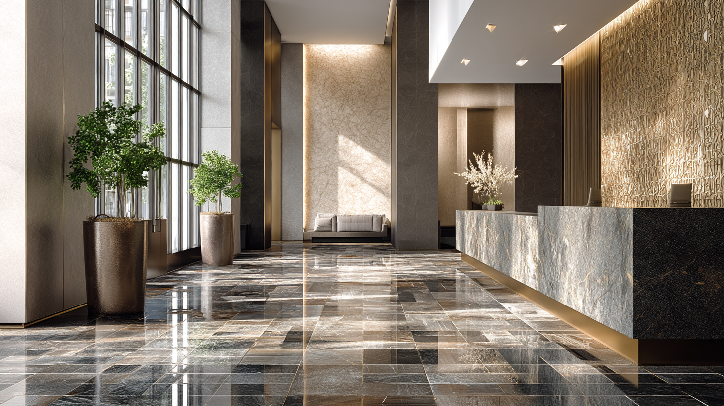
The final specification used a layered approach. The reception and lobby, the highest-traffic, most-client-facing zones, specified large-format porcelain pavers from the porcelain paver catalog. The commercial-grade slip rating, scratch resistance, and dimensional precision all favored porcelain. The colorway was a warm graphite Arterra colorway that read sophisticated against the warm-cream walls.
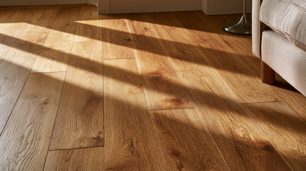
The conference rooms, executive offices, and common areas specified Nove Reserve in Akadia (Nove Reserve Akadia), the premium 22mil wear-layer carried the warm wood-grain reading throughout the office. The visual continuity from porcelain reception to LVT in private areas was achieved through colorway coordination, both surfaces ran in warm graphite-and-honey tonal range.
For the broader hardwood vs LVT vs WPC decision, see our flooring decision pillar; for the Nove specifics, our Nove curator guide.
The Countertop Specifications
Conference room counters, break-room counters, and reception desk surfaces all needed commercial-grade durability with residential-quality visual.
The specification for these surfaces: porcelain slab. The porcelain slab collection carried colorways with warm marble-look veining that read as natural stone at viewing distance and delivered the heat, scratch, stain, and UV resistance that commercial use demands. The reception desk was specified in a dramatic veined colorway, a single visual character moment that anchored the lobby. The conference room counters specified more restrained colorways that quietly supported the room's function.
For executives' desks and small surfaces, real natural stone (specifically a warm-toned quartzite) was the right specification, the lower use intensity allowed the natural material's character to be the value-add, with the material aging gracefully over decades.
For the porcelain slab vs natural stone comparison in commercial contexts, see our porcelain slab countertops and sintered stone vs natural quartzite guides.
The Wall Tile Specifications
The reception backdrop wall and the small kitchen area both received feature-tile treatment. The reception wall specified a porcelain slab in matched colorway to the reception desk, a continuous vertical surface that gave the lobby its architectural weight. We cover the slab cladding application in our porcelain slab wall cladding 2026 guide.
The kitchen-area backsplash specified large-format honed porcelain in a warm cream colorway from the wall tile and backsplash collection, quietly supporting the warm-modern direction without competing.
The Threshold Discipline
One specification detail that mattered meaningfully: every doorway transition received a stone threshold. The reception-to-corridor transition, every conference room entry, the executive office doorways, the kitchen entry. Marble thresholds throughout, in matched warm-cream tone.
The thresholds are one of those small specifications that distinguish thoughtful commercial from standard commercial. They handle the actual functional job, clean transitions between flooring materials at the rooms' boundaries, and they read as architectural language repeating across the office, signaling considered specification at every level. We cover the case in our 43 SKUs of quiet luxury guide.
The Hardware and Plumbing
The kitchen and break areas specified unlacquered brass plumbing, the patina trajectory we discuss in our unlacquered brass guide works as well in commercial settings as residential. The aging brass reads more sophisticated over time and forgives the small wear of daily commercial use better than lacquered alternatives.
Cabinet hardware throughout, break room, conference room storage, executive office details, specified in matched unlacquered brass. The unified hardware language across the office created the architectural through-line that distinguishes premium commercial from generic.
The Lighting Specifications
Commercial lighting historically runs at 4000K-5000K cool temperature for "office productivity." The 2026 evidence-based commercial specification (see our light, surface, and cortisol guide) is moving warmer, 3000K-3500K throughout most office space, with cooler temperatures only at specific task-light moments.
For Bidwell's office, the specification ran 3000K throughout client-facing space (reception, conference rooms, executive offices) and 3500K in active work areas. Dimmable in client-facing spaces; full-bright fixed in work areas. The lighting paired correctly with the warm-tone surfaces; the office reads warm-sophisticated rather than cool-clinical.
The Install Process
The commercial install ran more complex than residential, multiple zones, sequenced timing to allow phased move-in, additional permitting, and the coordinated logistics of multiple material categories arriving and installing simultaneously. The general contractor managed the construction sequence; we coordinated material delivery and answered installer questions through the process.
One specific installation detail worth attention: the reception lobby's porcelain pavers were installed in a stack-bond pattern (perfect grid alignment) rather than the more forgiving running-bond. Stack-bond reads more contemporary and architectural but requires the rectified-edge porcelain pavers (see our Arterra spotlight) and an experienced installer. The result reads as architecture, not as field installation.
What the Owner Said
From Bidwell Consulting's testimonial on the homepage: "Citadel Spaces and their team are all professionals and easy to work with. They helped us throughout the entire process... All were of the highest quality."
The "throughout the entire process" comment specifically mattered for this project. Commercial specifications run more complex than residential, and the curator's role through the process, material coordination, installer communication, problem-solving when small adjustments emerge, adds meaningful value beyond just the initial selection.
The Broader Lesson
Bidwell's project illustrates something important about commercial surface specification: the right answer is rarely a single category running through the whole space. Premium porcelain handles the highest-traffic moments; premium LVT handles private offices and lower-traffic zones; natural stone handles the surfaces where the material's character adds real value. The mix-and-match approach delivers both the durability and the visual sophistication that commercial-residential standards demand.
The discipline of layered specification, different materials for different use zones, unified through coordinated colorway and design language, is what separates the commercial specifications that read residential from those that read institutional. The visual continuity comes from tonal coordination, not from a single material running everywhere.
The Companion Pieces
For broader context on commercial-grade selection:
- Commercial hospitality tile, the broader commercial-tile selection question
- Flooring decision pillar, the foundational flooring framework
- Nove curator guide, the wide-plank LVT specification
- Porcelain slab countertops, the commercial counter specification
- Showroom to site, the full curator process
Where to Start Your Own Project
For commercial-residential projects, the right starting move is mapping the use zones, reception, conference, private office, common, kitchen, restroom, and specifying each zone against its actual use intensity rather than running one material throughout. Browse the porcelain pavers, luxury vinyl flooring, porcelain slabs, and countertops and slabs collections for the layered specification approach. Reach out for project-specific consultation, commercial specifications benefit meaningfully from curator coordination across categories.