Design Trends
Minimalism Lets You Breathe: The Spatial Psychology of Negative Space
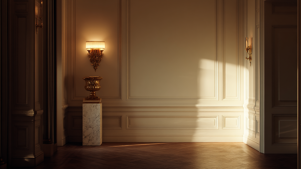
"Negative space", the empty wall, the empty corner, the surface with one object instead of three, sounds like an aesthetic concept. The aesthetic argument is real: rooms with significant negative space read more sophisticated and more considered than rooms without. The deeper argument is physiological: negative space measurably affects how human bodies behave in a room. Specifically, it slows breathing, reduces sympathetic nervous-system activation, and lowers stress hormones.
This guide explains the science briefly and translates it into specific specification choices. For the broader nervous-system framework, see our neuroscience of calm interiors pillar; for the related material-texture mechanism, our material texture and the vagus nerve guide.
What "Negative Space" Means
In design context, negative space is the part of a room that doesn't contain visual content, empty wall, empty horizontal surface, empty volume. It isn't "missing furniture" or "unfinished design." It's the deliberate absence that allows the room's positive elements (the furniture, the art, the architectural features) to read clearly.
The opposite is visual density: rooms where every wall has art, every surface has objects, every corner has furniture, every visual zone competes for attention. Densely-furnished rooms can be beautiful, but they're cognitively expensive, the eye and brain do continuous work parsing the visual content.
The 2026 considered residential interior leans heavily toward significant negative space. Not pure minimalism (rooms with almost nothing). That produces its own kind of stress, but rooms where 50-70% of the visual space is empty, allowing the 30-50% with content to read clearly.
The Physiological Effect
The research on negative space and physiology is relatively recent but increasingly consistent. Specific findings:
- Visually busy environments produce sustained low-level sympathetic activation (raised heart rate, shallower breathing, elevated cortisol)
- Visually quiet environments allow parasympathetic dominance (slowed heart rate, deeper breathing, lower cortisol)
- The transition between busy and quiet environments produces measurable physiological shifts within minutes
- Cumulative effects on stress measures, sleep quality, and cognitive performance favor environments with substantial negative space
The mechanism appears to be attentional load. The visual cortex continuously processes incoming visual information; busy environments require more processing, which activates broader nervous-system arousal. Quiet environments allow the visual cortex to relax, which permits parasympathetic activation across the rest of the system.
Why Strict Minimalism Fails
One specific finding: pure minimalism, rooms with almost no objects, no texture, no warm material, doesn't produce the parasympathetic effect that negative space alone would predict. Research suggests these environments can produce their own stress response, possibly through the absence of natural-environment cues that the nervous system expects.
The right approach is negative space with material warmth and texture, empty walls but plaster-textured rather than smooth, empty corners but warm wood floors and natural light, empty surfaces but woven natural rugs underneath. This is the spec we cover in our Midimalism guide, minimalism's discipline crossed with warm material vocabulary.
The Specification of Negative Space
Specifying negative space is more about restraint than addition. Three primary moves.
Resist the urge to fill walls
The instinct in many residential designs is to put art on every wall, sometimes multiple pieces per wall. The negative-space specification limits art meaningfully, typically one or two strong pieces per major room, with most walls left empty.
The empty walls aren't "incomplete." They're the visual rest that lets the art read.
Resist the urge to fill horizontal surfaces
The instinct is to populate every horizontal surface with decorative objects, vases, books, candles, framed photographs. The negative-space specification keeps surfaces mostly empty, with deliberate single objects rather than collections.
The empty horizontal surfaces aren't "needs accessories." They're the visual rest that lets the few objects read.
Resist the urge to fill corners
Empty corners read as architectural punctuation. Filled corners, with floor lamps, plants, secondary furniture, fragment the room's geometry. The negative-space specification leaves corners visually quiet in most rooms.
The Furniture Question
Negative space affects furniture selection more than most homeowners realize. The standard residential approach overpopulates rooms, sofa plus loveseat plus two chairs plus ottoman plus side tables plus coffee table plus accent chairs plus benches. The result is the room read as "lots of furniture" rather than as "considered space."
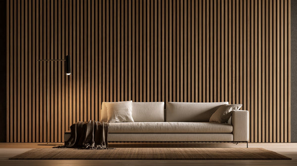
The negative-space specification dramatically reduces furniture count: a sofa, one or two complementary seats, a single coffee table or low surface, perhaps one accent piece. The room reads as architecture with furniture rather than as furniture in a room. The empty space between the furniture is part of the design.
The Object Question
Decorative objects, books, vases, sculptures, candles, accumulate in residential interiors. The standard approach has dozens or hundreds of small objects across surfaces and shelves throughout a home.
The negative-space specification keeps total object count meaningfully smaller. Each object is chosen carefully, placed intentionally, and given space to be seen. The collection reads as "considered" rather than as "stuff that ended up here."
This isn't about owning less; it's about displaying less. Storage solutions (drawers, cabinets, behind-door organization) keep the items that need to exist out of the visual field. The visible objects are a curated subset.
The Wall and Ceiling Plane
The largest negative-space surfaces in any room are the wall and ceiling planes. The specification of these surfaces matters meaningfully.
Walls: Warm-cream paint or hand-applied plaster (rather than busy wallpaper or heavily-decorated walls). Simple architectural moldings (rather than ornate). Moderate or no chair-rail or wainscoting. The wall reads as a quiet field.
Ceilings: Quiet white or warm cream. Simple light fixtures. Avoid: heavy tray ceilings with multiple decorative levels, heavy beam ceilings (unless the architecture is genuinely traditional and the beams are honest), elaborate moldings.
The Storage Discipline
Negative space requires storage discipline. The objects that aren't visible have to live somewhere; if they don't have dedicated storage, they accumulate visually. Closets, cabinets, drawers, behind-door organization, the visual quietness of a room is achievable only with adequate hidden storage.
This is where the cabinet specification matters meaningfully (see our cabinet decision tree). Generous cabinet space throughout, not just kitchen, but bathrooms, mudrooms, primary closets, common-area storage, supports the negative-space discipline.
Room-Specific Negative-Space Recommendations
Living rooms
50-70% of wall space empty. One or two strong art pieces. Sofa plus 1-2 complementary seats. Single coffee table. Significant floor space visible (large rug rather than small rugs). Empty corners. Few decorative objects.
Bedrooms
60-80% of wall space empty. Bed against one wall, small dressers if needed, possibly one accent chair. Most surfaces empty or with single object. Large empty floor zones. The negative space supports the sleep-focused function of the room.
Kitchens
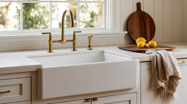
Empty counter surfaces between work zones. Decorative objects only at intentional accent points, not distributed across the counter. The kitchen reads as architecture with appliances rather than as cluttered work surface.
Bathrooms
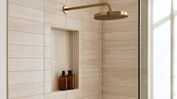
Empty horizontal surfaces (vanity counter mostly clear of products, products in cabinets). Empty walls except for one piece of art or a single mirror. The bathroom reads as refuge.
The Texture-Negative-Space Combination
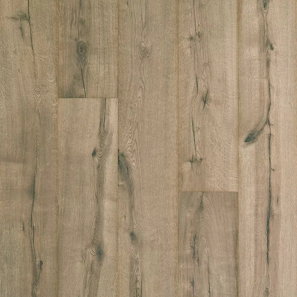
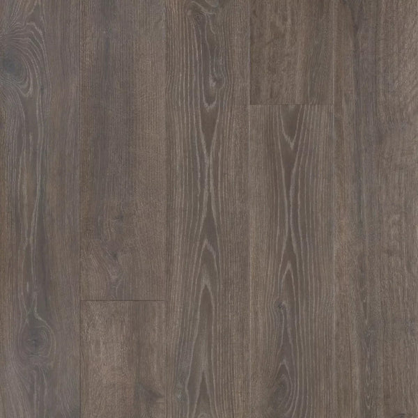
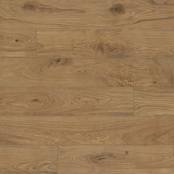
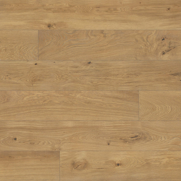
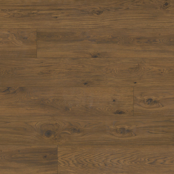
The most successful Midimalism-style interiors combine significant negative space with material texture. The walls are mostly empty and hand-plastered. The floors are mostly visible and wide-plank wood with visible grain. The empty corner has no furniture but has natural light hitting the warm wall behind it. The negative space and the material texture work together.
Strict minimalism without texture reads sterile. Strong texture without negative space reads busy. The combination of both is what produces the calming-but-warm interior the 2026 design conversation is aiming at.
The Permission-to-Have-Less Argument
One social aspect worth attention: many homeowners over-furnish and over-decorate because they've absorbed cultural messages that "more" reads as "better-cared-for" or "wealthier." The opposite is more accurate: restraint reads as sophisticated, considered, and confident.
Premium residential interiors increasingly use negative space as a status signal in itself, the home that doesn't need to fill its walls reads as more secure than the home that does. This is the social shift behind the Midimalism / negative-space direction.
Where to Start
For homeowners working toward more negative space, the strongest immediate moves: edit the visible objects in any room to half their current count, remove all but the strongest 1-2 art pieces from each major room, replace small furniture pieces with larger single statements, and resist the urge to "decorate" empty surfaces. The room reads better and the body responds. For the broader specification context, our Midimalism guide, neuroscience of calm interiors pillar, and biophilic design 2026 guides.
From the guide
Shop the surfaces in this guide