Buyer Guide
Wall Tile & Backsplash: Texture, Light, and the Quiet Backdrop
Wall tile and backsplash sit in an undervalued spot in residential design. Floor tile gets considered carefully because feet touch it; counter material gets considered carefully because it's worked. Wall tile is what surrounds those decisions and shapes how the rest of the room reads, and the spec gets made fast, often last, often as the budget's flex line. The result is a familiar pattern: a careful kitchen with a hurried backsplash, a thoughtful bathroom with wall tile that fights the architecture.
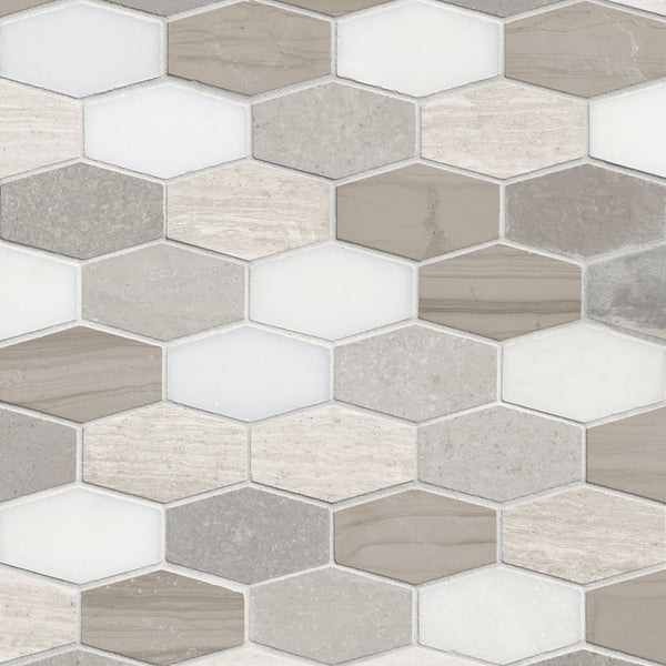
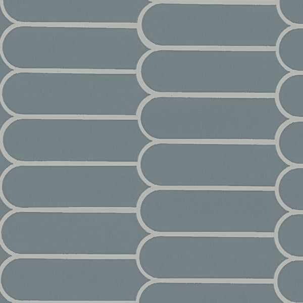
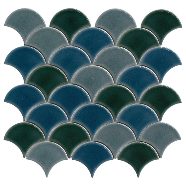
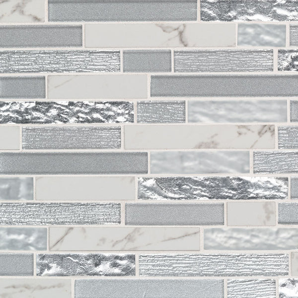
This guide treats wall tile as the architectural element it actually is. The 711-colorway wall tile and backsplash collection is the single largest sub-category in the catalog because the design conversation here is wider than any other. Texture, light, pattern, and the quiet backdrop that lets the room's other moves read.
Wall Tile Does Three Jobs
The first is functional, protecting wall surfaces in wet and high-use zones. Behind a kitchen sink, in a shower, behind a vanity, around a tub. Tile handles water, oil, and the cleaning that wall paint can't survive.
The second is acoustic and tactile, tile reads cooler and harder than painted drywall, gives the room a different feel underfoot at the threshold and a different feel acoustically when you speak in it. Wall tile in a small powder room dramatically changes the reverberation; the room feels smaller and more intimate.
The third is aesthetic, and this is where the specification gets weighed. Wall tile is the room's largest visual surface after the floor and ceiling. It either holds the architecture together or fragments it.
The Quiet Backdrop Principle
The strongest 2026 wall tile specifications follow what design theorists call the quiet backdrop principle: the tile recedes so that the room's stronger visual elements (the slab, the cabinetry, the lighting, the plumbing fixtures) read clearly. A loud, patterned, high-contrast backsplash competes with the marble counter; a quiet stack-bond honed marble tile lets the counter be the room's character.
This doesn't mean wall tile should be invisible. It means wall tile should be considered against the room's other moves, what's the visual anchor, and is the tile supporting it or competing with it?
When wall tile is the backdrop
Most kitchens. The cabinetry, the slab, the appliances, and the lighting are doing the visual work. The backsplash's job is to clean up the wall surface between counter and upper cabinets without adding noise. Honed marble in stack-bond layout, simple white subway in stacked or running-bond, large-format porcelain in a quiet stone-look, all read as backdrop.
When wall tile is the character
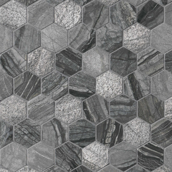
Powder rooms, accent walls, fireplace surrounds, shower feature walls. Small spaces or single-wall installations where the tile is meant to be the room's character. Here, the tile can be more dramatic, bold pattern, strong color, distinctive texture. The constrained scale lets the visual intensity work.
Texture and Light
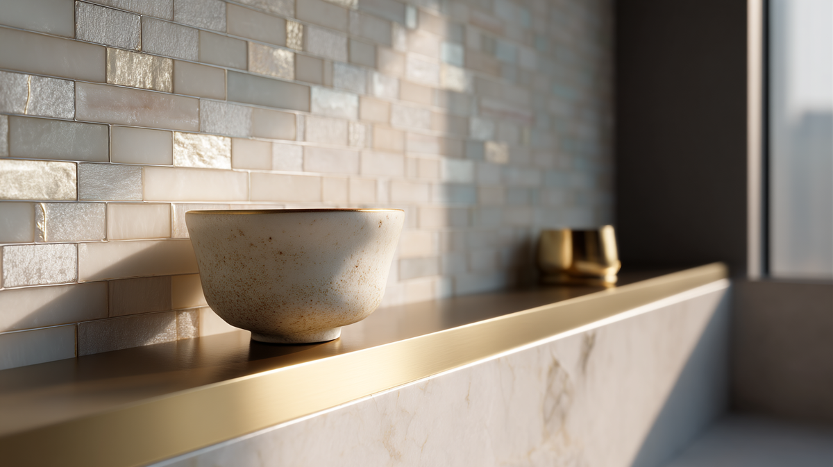
The least-considered wall tile decision is texture, and it's one of the most important. Smooth honed and polished tiles bounce light evenly across the surface. Textured tiles (handmade, fluted, three-dimensional relief) catch light differently, creating shadow patterns that change with the time of day and the lighting source.
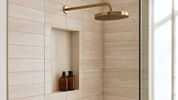
The 2026 trend is toward subtle texture, fluted vertical patterns on shower walls, three-dimensional concrete-look porcelain in modern kitchens, small-format handmade tiles in bathrooms. The texture adds depth without adding pattern noise. Browse the wall tile and backsplash collection for the textured subset.
Conversely: polished and high-gloss wall tile reads dated except in narrow contexts (powder rooms with theatrical lighting, specifically classical interiors). The matte and honed defaults read more current and more durable visually across years.
Pattern and Layout
Five common wall tile layouts, each carrying different connotations.
Stack bond, perfect grid alignment. The most contemporary, demanding of dimensional precision, and the most "quiet backdrop." The 2026 default for honed marble and large-format wall tile.
Running bond (offset), each row offset by half a tile. The most-traditional layout, especially for subway tile. Forgives dimensional variation; reads softer.
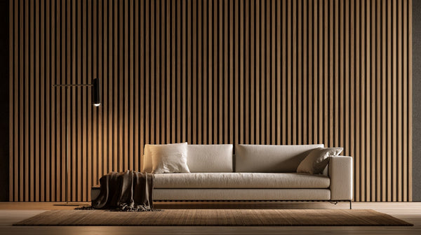
Vertical stack, tiles stacked vertically rather than horizontally. Reads contemporary and emphasizes vertical lines; visually heightens a room.
Herringbone, 45-degree chevron. Decorative and emphatic. Right for accent applications (fireplace hearths, single-wall feature) and small-format tiles.
Basketweave, alternating horizontal and vertical pairs. Traditional, decorative. Right for classical architecture; reads dated in contemporary contexts.
We cover the layout decision in depth in our tile layout patterns guide (in queue).
Format and Scale
Wall tile format dramatically affects how a room reads.
Small format (3×6 subway, 4×4) reads traditional and busy at scale. Right for accent applications and traditional architecture; reads dated in contemporary kitchens.
Medium format (6×24, 8×32) reads contemporary and proportional. The residential 2026 default for most kitchen and bathroom backsplash.
Large format (12×24, 24×48, slab-format wall cladding) reads distinctly modern, requires careful substrate preparation (any wall irregularity reads through large tiles), and creates the most uninterrupted visual surface.
Slab-format wall cladding is its own category, porcelain or natural stone slabs run as wall cladding without grout joints. The most contemporary residential wall surface available; covered in our porcelain slab wall cladding 2026 guide.
Material Categories
Marble wall tile
The classical residential premium. Honed Carrara, Calacatta, Crema Marfil. Reads premium, ages with patina, demands sealing in wet applications. See our marble tile guide.
Porcelain wall tile
The contemporary default. Marble-look, stone-look, concrete-look, solid color. Lower maintenance, no sealing, dimensional precision. Browse the ceramic and porcelain tile collection.
Glass tile
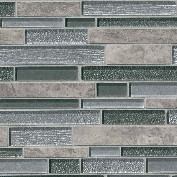
Glass mosaic and glass tile reads bright and reflective. Strong choice for shower accent walls and pools where the reflectivity is the design intent. Less common in current kitchen backsplash than five years ago.
Metal tile
Metal mosaic and metal tile reads industrial and contemporary. Specific applications, accent strips, contemporary backsplash, brushed-metal shower bands.
Stacked stone
Stacked stone veneer as wall surface, see our stacked stone veneers spotlight. The dramatic-texture option for fireplaces and accent walls.
The Backsplash Specifics
Three backsplash decisions worth attention.
Height. Standard is between counter and upper cabinets, but full-height backsplash (counter to ceiling, behind a hood, or on an end-wall) reads more contemporary and unifies the wall plane. Slab-format full-height backsplash is the strongest contemporary move.
Material continuity with counter. Running the same material on counter and backsplash (a single slab carrying the counter and a partial-height backsplash riser) reads exceptionally clean. Common with quartzite and porcelain slab.
Edge treatment at upper cabinet. The transition between backsplash tile and the underside of upper cabinets wants intentional resolution, a small color-matched grout joint, a tile bullnose edge, or a stone Schluter-style trim. The detail reads as care.
The Bathroom Specifics
Wall tile in bathrooms covers more area than in kitchens, full shower surrounds, full or partial wainscot, sometimes ceiling. The decisions amplify.
Shower surrounds want substrate that handles long-term moisture exposure (cementitious backer board over waterproof membrane, or a fully waterproofed system). Tile in showers wants slip-rated floor tile where feet land, regardless of wall tile choice.
Wainscot height, typically 36 to 48 inches above floor, establishes a horizontal proportion that the rest of the bathroom reads against. Higher wainscot reads more traditional; lower or no wainscot reads more contemporary.
Ceilings tiled in steam showers, a real consideration for premium bathroom installations, extend the tile's water-management role to the full enclosure.
Where to Start
Specifying wall tile starts with the question: is this the room's backdrop or the room's character? That decision drives format, color, pattern, and texture. Browse the wall tile and backsplash collection for the full library across material families. For specific deep-dives, see our marble tile guide, stacked stone spotlight, and porcelain slab wall cladding pieces.
To take this from reading to ordering, browse wall tile and backsplash and run your measurements through the flooring and tile coverage calculator.
From the guide
Shop the tile in this guide